After sketching out some ideas for my Confectionery Brief logo, I took them digitally and began to develop my ideas further. I tried to find typefaces on DaFont.com to see if there was one that would fit with my initial sketches and the approach I was looking for. At first I used one typeface and then began to combine different typefaces to create something a bit more exciting. The logo that I have chosen to work with is the bottom left one.
This logo will be further developed to ensure that it is clear and well made as well as being able to be applied to different products.
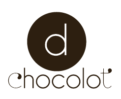
This is the final logo that I will be using for this brief. The first and last letter are a different typeface to the middle. I think this works well as these add a bit of interest to the whole design. I wanted the logo to look quite sophisticated but not too fussy. That's why I have kept the middle letters very simple.
This is just the logo reversed out to show it can work either way.
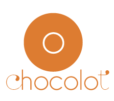
I have then changed the colour of the logo and this will be determined by the flavour of the chocolate. So far I have white, milk, dark, mint and orange chocolate. These will be developed further as I research into more chocolate combinations.
I have also began to play with icons to represent the different flavours of chocolate in my product range. I have tried to keep it simple by just using colour and type to communicate a flavour. I think its pretty clear what I am communicating when you see everything together.
I have then created little icons to show what the flavour is, I will be experimenting with these a bit later on.
I have tried to use colours that arent too bright as I wanted to keep the palette quite sophisticated.


No comments:
Post a Comment