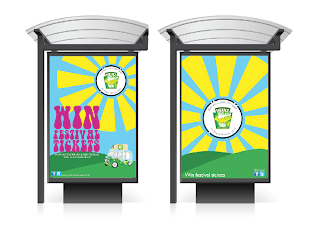
These are the posters that I designed to go on Ad Shells to promote the Salad Cream tour van. There will be a series of posters that will be released as the tour evolves. The first poster will give information about Snap Tagging and how to win festival tickets. There will then be one about buying salad cream with a Snap Tag on it and finally the poster with all of the information on it about Snap Tagging and winning festival tickets.
I have kept the designs simple and used the same colour palette, illustration technique and tone of voice as the salad cream van to keep everything consistant. I decided to use a typeface that reflected our tone of voice, Bell Bottom is very 60's and fits perfect with the design approach we are going for.
The Snap Tag poster is very simple, it is literally just the Snap Tag itself as I didnt want to add to much information so that people would become disinterested or distracted by other things.
These are the posters mocked up as Ad Shells. They have turned out really well.


No comments:
Post a Comment