I started by thinking of problems i have had to face since getting a place on the course, things that i am wanting to make for the final outcome of this brief in relation to my ideas and subjects and themes i am wanting to focus on.
5 problems since the point of getting a place on the course:
- home sickness: I am very close to my family so moving away from home was a VERY big thing for me.
- applying for student finance: they are useless!
- saving money up- i found it hard putting nearly all my wages into savings each month for uni.
- growing up- being an adult with responsibility scared me.
- worrying whether if my work would be good enough- even though i did get a place on the course.
5 things i want to make:
- a short stop motion- animated with hand drawn stuff.
- screen prints (new found love)- not sure what format though yet.
- a survival pack for new students.
- posters (but they need to look uber cool)
- a blog/ website
5 subjects/ themes your interested in dealing with:
- money management
- time management
- home sickness
- growing up
- how to deal with stress from being a student
Brainstorming:
- survival guide
- design packaging for a survival pack
- could contain things like postcards with advice on, simple recipes, places to visit, places to buy stuff ect
- maybe designs for tote bags rather than a box
- screen print 'feel good posters'
- a guide to dealing with stress: things like homesickness, money, time, work load, flat mates, friend making...
- needs to be original and humerous yet helpful
- research: questionnaire asking students about experiences
- create a brand for my work to make it look more proffesional
- design a blog/ website where you can get advice about everything student wise
- i want to base my final piece on my own experiences that will help others
---------------------------
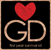
I started to design a logo for my survival kit, i based it upon brown paper so it gave it a hand rendered feel, i wanted to keep the logo and branding simple. I drew inspiration from the I LOVE NY' posters by Milton Glaser, but replacing the NY with GD (graphic design). I dont want my designs to have a hand rendered feel to them because this is a style that i like working in. The font that i used is century gothic, i used this in a past brief. I like it because it is a simple san serif that is quite slim.
With the above design i joined all the letters/ symbols together, but it looked a bit confusing and too complicated. I havent added any colour on the heart with this design, the whole thing has been blended into the background brown paper (which is an image taken from google). The blend mode i used was multiply, the type was initially white but now the same as the background because of blending.
With this design i have added red to the heart and taken away the 'I'. The letter are still joined but the heart floats above. I think design works better visually because it has been kept simple and the red makes the whole thing stand out (and also highlights the fact that if your on this course then you should love graphic design).
This design has developed from the one before, i have kept most of it the same and then added a caption underneath to state what it is. The lettering is now more central inside the rounded square too.
This is the same as the above but i have separated the G and D, not sure which one i prefer yet though.
--------------------
Packaging ideas:
I started to design packaging for my survival kit still using the brown paper effect, this net will be a box that will have a separate lid (which i havent designed yet). The chosen logo would go on one side plus the lid, on the base would be my name, and on the opposite side to the logo there would be a list of what is inside the box. A few of the designs have the main logo on one side then a simplified version on all the other sides.
-------------------------
I think i need to start looking at packaging that i like and find inspiring because at the moment the more i look at my ideas so far the more i dont like them! I think i need to research before jumping in on designing something that will actually work and look good. From researching i can then take inspiration from existing packaging and combine them with my own ideas and style.
For my survival kit i was thinking of doing it in a similar style to my 'what is a line' brief in the OUGD104 module because it was a style that i enjoyed working in. Sometimes i feel that using the computer for everything is lazy and cheating a bit. I like hand drawing things, it has a more personal quality to it.
---------------------
More ideas:
/ takes photos of graphic related items and places, such as: studios, print room, briefs, equipment, mac rooms, places to eat lunch, food, bed, haribo etc.
/ trace the photos and then live trace them in illustrator for editing.
/ create a book containing my illustrations with information about the course: workload, time and money management, not stressing and having fun etc.
/ try out different stocks to print onto.
/ make time to screen print posters.
/ design a small hotdog book or two with quick tips in (maybe DOs and DONTs).


No comments:
Post a Comment