Friday 29 April 2011

Speaking from experience..research...

I started doing some research for this brief by asking people in my group to tell me the best part of the course so far, the worst part and one piece of advice they would give to the newbies. I wrote on the GD facebook page to gather my primary research. With the research that i am gathering i would like to create a small advice book to go into my GD survival kit to help make the newbies feel at ease when they start the course, and the most important thing is that it is us speaking from experience.


Luke O'Brien Take it easy, and enjoy is the advice and the hardest thing is just the constant juggling of work! and that is the hardest part of the course! x

Kirsty Alderson The hardest thing is juggling different briefs all at once and keeping track of what you've get left to do. The best thing has been beginning to find my style and also the course has helped me gain confidence.The advice i'd give is not to get too stressed, work hard and don't take taught time for granted! x

 Sophie Wilson i think the hardest part is absorbing so much new information in one go- as fred eloquently put "the course is like drowning...but by the third year you'll learn how to love drowning" haha...the best thing is the excitement you get from producing something that has a profound effect..and seeing your work go to print! :) my advice would be...plan, plan plan and for gods sake get some sleep xx

Sarah Pritchard The hardest part of the course is juggling all the different modules going off at once, and knowing which to prioritise without neglecting others too much. The best thing has to be the people, and how much I've actually learnt in such a short space of time. The advise I would be is to just keep on top of everything as it will make life easier days before module deadlines.

Baljeet Kaur Samra Hardest thing has been keeping up with the pace of the course and the best thing is everything I've learnt :) my advice would be don't be late. Ever.

Christoffel Van Niekerk hardest was being confident in my own work and getting use to all the briefs at once. Best thing about the course has been all the facilities and eddie cooper. My advice to the year one would be work hard and make mistakes.

Lisa Whitaker The hardest thing has been keepin the pace especially after getting absorbed with Collection 100 and the CTS essay, I found it really hard to motivate myself fot the next briefs. Best thing is the work ethic and the people. My advice is experiment and get absorbed in it all. x
Bethany Yates hardest thing was probably getting used to all the things going on at one, best thing is just the course and all the people on it - everything is so much fun. advice? try hard, make mistakes and laugh a lot

Charlie Crosby getting into the habit of thinking, doing and living design
the best thing is how much you do and learn it really does make you appreciate the £3296 you pay to come here (not sure if that number is correct)
i would say stay in the studios till late and then go home and relax once you've done your work and then go out.


Lisa Whitaker It is not essential to buy a Macbook in your first year x


------------------------

The 10 Commandments - God's Revelation in the Old Testament
The 10 Commandments are found in the Bible's Old Testament at Exodus, Chapter 20. They were given directly by God to the people of Israel at Mount Sinai after He had delivered them from slavery in Egypt:

"And God spoke all these words, saying: 'I am the LORD your God

ONE: 'You shall have no other gods before Me.'

TWO: 'You shall not make for yourself a carved image--any likeness of anything that is in heaven above, or that is in the earth beneath, or that is in the water under the earth.'

THREE: 'You shall not take the name of the LORD your God in vain.'

FOUR: 'Remember the Sabbath day, to keep it holy.'

FIVE: 'Honor your father and your mother.'

SIX: 'You shall not murder.'

SEVEN: 'You shall not commit adultery.'

EIGHT: 'You shall not steal.'

NINE: 'You shall not bear false witness against your neighbor.'

TEN: 'You shall not covet your neighbor's house; you shall not covet your neighbor's wife, nor his male servant, nor his female servant, nor his ox, nor his donkey, nor anything that is your neighbor's.'


--------------------------

A black box: definition found on wikepedia.com

In aviation, a "black box" (they are actually bright orange, to facilitate their being found after a crash) is an audio recording device in the cockpit of an airplane or helicopter. It records the conversation of the pilots during a flight, so if something goes very wrong, investigators can use the black box recording to determine what happened. Although these devices were originally called black boxes for a different reason, they are also an example of a black box according to the meaning above, in that it is of no concern how the recording is actually made.
Thursday 28 April 2011

Speaking from experience..concept boards...


-----------------------


Speaking from experience..workshop 1...

Thursday 28th April 2011- workshop 1

The five problems we came up with after the briefing with Fred:

1: saving up money
2: procrastination
3: homesickness
4: growing up
5: dealing with the course

The five problems within the problem plus possible solutions:

1: saving money up:

- guide on how to save
- poster with quirky statement- 'do you really need that?'
- map with local building societies to open a savings account
- ways to budget your money- buying value food rather than branded (with star ratings)- guide
- facebook pages for students to share tips on how to save and where to buy things for good value

2: procrastination:

- advice on time management
- a diary or a calendar
- time management posters- could be screen printed
- design a 'to do list' book to help students manage their time- with a feel good factor
- create a stop motion to motivate students- could be based around just type

3: homesickness:

- write letters to family and friends- could design special paper and envelopes plus packaging
- calendar design so students can count down the days to when they next go home
- poster saying something like ' home is only a phone call away'- something to make them feel better
- a guide to overcoming homesickness- things to do and keep your mind off home
- could be part of the survival kit/ guide- could receive when you start the course or move into halls?

4: growing up: cooking, cleaning, washing, job hunting etc...

- student friendly meal guide
- cheap cleaning products with guide on where to get them from
- ways to meet new people and make new friends- could be postcard based
- guide to finding a job- how to write a good CV etc
- managing play time with work time- guide/ booklet/ mail shots

5: dealing with the course: workload, printing, materials etc

- guide/ map where to buy good yet cheap materials for the course, maybe a reading list too
- how to manage your time- advice cards
- design a course blog, with first person advice about the course
- ask everyone in the current first year for one piece of advice for the new first years
- guide to having fun on the course- include things like typogateaux- its not all work and no play!

I am wanting to create some kind of survival kit for new GD students, i want to keep it light hearted and funny. I feel that if i make things too serious the new students will either worry about the course or lose interest in something that sounds too formal as it might seem boring.

The survival kit would include things like a book of the DO'S and DON'TS of being a GD student i.e dont use comic sans!

I want it to be full of quirky things that will make them feel at ease and maybe make them laugh but at the same time it needs to be useful to them.

Wednesday 27 April 2011

Speaking from experience: ideas...

Initial ideas for the 'speaking from experience' brief (AKA last brief of the first year!):

I started by thinking of problems i have had to face since getting a place on the course, things that i am wanting to make for the final outcome of this brief in relation to my ideas and subjects and themes i am wanting to focus on.

5 problems since the point of getting a place on the course:

- home sickness: I am very close to my family so moving away from home was a VERY big thing for me.
- applying for student finance: they are useless!
- saving money up- i found it hard putting nearly all my wages into savings each month for uni.
- growing up- being an adult with responsibility scared me.
- worrying whether if my work would be good enough- even though i did get a place on the course.

5 things i want to make:

- a short stop motion- animated with hand drawn stuff.
- screen prints (new found love)- not sure what format though yet.
- a survival pack for new students.
- posters (but they need to look uber cool)
- a blog/ website

5 subjects/ themes your interested in dealing with:

- money management
- time management
- home sickness
- growing up
- how to deal with stress from being a student

Brainstorming:

- survival guide
- design packaging for a survival pack
- could contain things like postcards with advice on, simple recipes, places to visit, places to buy stuff ect
- maybe designs for tote bags rather than a box
- screen print 'feel good posters'
- a guide to dealing with stress: things like homesickness, money, time, work load, flat mates, friend making...
- needs to be original and humerous yet helpful
- research: questionnaire asking students about experiences
- create a brand for my work to make it look more proffesional
- design a blog/ website where you can get advice about everything student wise
- i want to base my final piece on my own experiences that will help others

---------------------------

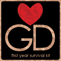
I started to design a logo for my survival kit, i based it upon brown paper so it gave it a hand rendered feel, i wanted to keep the logo and branding simple. I drew inspiration from the I LOVE NY' posters by Milton Glaser, but replacing the NY with GD (graphic design). I dont want my designs to have a hand rendered feel to them because this is a style that i like working in. The font that i used is century gothic, i used this in a past brief. I like it because it is a simple san serif that is quite slim.


With the above design i joined all the letters/ symbols together, but it looked a bit confusing and too complicated. I havent added any colour on the heart with this design, the whole thing has been blended into the background brown paper (which is an image taken from google). The blend mode i used was multiply, the type was initially white but now the same as the background because of blending.


With this design i have added red to the heart and taken away the 'I'. The letter are still joined but the heart floats above. I think design works better visually because it has been kept simple and the red makes the whole thing stand out (and also highlights the fact that if your on this course then you should love graphic design).


This design has developed from the one before, i have kept most of it the same and then added a caption underneath to state what it is. The lettering is now more central inside the rounded square too.


This is the same as the above but i have separated the G and D, not sure which one i prefer yet though.

--------------------

Packaging ideas:


I started to design packaging for my survival kit still using the brown paper effect, this net will be a box that will have a separate lid (which i havent designed yet). The chosen logo would go on one side plus the lid, on the base would be my name, and on the opposite side to the logo there would be a list of what is inside the box. A few of the designs have the main logo on one side then a simplified version on all the other sides.

-------------------------

I think i need to start looking at packaging that i like and find inspiring because at the moment the more i look at my ideas so far the more i dont like them! I think i need to research before jumping in on designing something that will actually work and look good. From researching i can then take inspiration from existing packaging and combine them with my own ideas and style. 

For my survival kit i was thinking of doing it in a similar style to my 'what is a line' brief in the OUGD104 module because it was a style that i enjoyed working in. Sometimes i feel that using the computer for everything is lazy and cheating a bit. I like hand drawing things, it has a more personal quality to it.

---------------------

More ideas:

/ takes photos of graphic related items and places, such as: studios, print room, briefs, equipment, mac rooms, places to eat lunch, food, bed, haribo etc.
/ trace the photos and then live trace them in illustrator for editing.
/ create a book containing my illustrations with information about the course: workload, time and money management, not stressing and having fun etc.
/ try out different stocks to print onto.
/ make time to screen print posters.
/ design a small hotdog book or two with quick tips in (maybe DOs and DONTs).


Speaking from experience...

The Brief:

Produce a graphic response/ graphic product/ piece of work that makes a statement, comment, observation or gives advice about your experiences on your first year of this course.

Choose any appropriate media or format and develop and identify the content, will it be entertaining, advisory or informative.

Considerations:

Message, audience, content and media. The wow- factor, intrigue or humour. Language, type or image, or a combination of the two.

If you choose to work collaboratively you'll need to maintain your own ongoing documentation of the project.

In addition tot he work required by this brief , you will need to provide evidence of research, development and practical investigation through notebooks and design sheets.

Concept/ proposition:

Think about the new experiences that you had, the difficulties that you have overcome and the new people that you have met and the life skills you have aquired this year.

Background:

Remember what it was like starting your first week, how did you feel and what emotions did you experience? Excitement, trepidation, fear or did you feel overwhelmed. You might have benefited form some advice, opinions and insights from others that have experienced the same transition.

What might you say, do or give to next years graphic design students to make the transition into the student experience, particularly this course more welcoming?

Mandatory requirements: Enjoy the process of reviewing your first year!

Deliverables:

Design development sheets, support work and notebooks.

Resolved design solutions in a format and media appropriate to your ideas.

Rationale and evaluation.

Studio deadline:

Friday 20th May 2011

Monday 25 April 2011

OUGD104..End of module evaluation...

1. What skills have you developed through this module and how effectively do you think you have applied them?

I think that my oberservational skills and my imagination have improved. Throughout this module i have had to look at everything in a different way. It was not about how i saw things or interpreted them, but how others would interpret my work. I think i am learning to communicate better, which i think was the purpose of this module. The workshops allowed me to try new things and develop many skills, such as type and grid which has been handy in the OUDG103 module. The main skill that has been developed is the ways in which i can communicate an idea, i feel like i can be more creative now.

2. What approaches to/ methods of research have you developed and how have they informed your design development process?

With the what is a line brief, i sourced a lot of primary research, the process to my final piece was all my own work. For the design context part of this brief, i obviously looked at secondary sources for ideas and inspiration. My research was mainly visual, by looking at various landscapes and skylines from different places, as to compare them. Looking at different skylines for the what is a line brief, helped me select a varied array of skylines that worked well together for my final ideas and solutions.

3. What strengths can you identify in your work and how have/ will you capitalise on these?

With the what is a line brief, i found it hard to get into to start with, but once i had a solid idea of what i wanted to do, i think it went well. I really liked the style that i started to work in and also the process that i worked in. It works well with the theme of the brief, it is one that i will continue to experiment with past this module.

4. What weaknesses can you identify in your work and how will you address these more fully?

During the workshops at the start of the module i think i was a bit rubbish at experimenting with communcating, i found it hard to just think of ideas on the spot. I found that i over complicated my ideas sometimes too, which just made things difficult for myself and resulted in my work not communicating what it was supposed too. With the book fair brief, i think i really struggled. I had really bad time management, when we first got the brief i didnt do any work for it for like 3 weeks, then when it came close to the deadline i hated my design and was really disappointed and embarrassed by it. So a week before deadline i changed my idea and produced something that i had actually put some effort into and i managed to sell a book.

5. Identify 5 things that you will do differently next time and what do you expect to gain from doing these?

- Put all my effort into everything i do, then i cant be disappointed with my work or the grade i get for it, if i do this i can be content with myself knowing that i tried my best.

- Try and think of as many ideas as possible, it doesnt matter if they dont work, at least i would have tried them. This will improve my creativity and make me more confident with my ideas.

- Stop procastinating as il get more work done.

- Research more, it is so important, i need to look at work that i aspire to be like and work that is relevant to the brief, as it will help me to understand my work and communicate it effectively.

- Seek help when i need it, sometimes i find it hard to ask for help and advice with my work. If i have a problem i need to ask for help or the quality of my work could be jepardised.

6. How would you grade yourself on the following areas? 1= poor, 5= excellent

- Attendance: 4
- Punctuality: 4
- Motivation: 3
- Commitment: 3
- Quality of work produced: 4
- Quantity of work produced: 3
- Contribution to the group: 3

Tuesday 19 April 2011

What is a line?...development...

After taking photos and researching and drawing for the 'what is a line?' brief, focusing on skylines, i have started to develop my ideas to produce a final outcome. I have completed a sketch book and a half of drawings of skylines, mainly from Leeds, London and Amsterdam. I used a tracing paper sketchbook so that i could trace the skyline from photos that i have taken myself. It worked really well using the tracing paper because you can see all the skylines through the pages, as tracing paper is opaque.

I have scanned in examples of what my sketchbook looks like, it looks really interesting, simply because of the stock i used. I am going to scan each page individually so i can play around with the drawings. I also drew skylines with more detail, there are snippets of buildings so it gives you an idea of where and what the skyline is of.


Below i started scanning in and editing the simple drawings and adding them on top of each other to make a more complex drawing, much like the pages of my sketchbook, just tidier. As you add more skylines, it becomes very busy and maybe messy, you can still see its skylines but its just another way of seeing them.


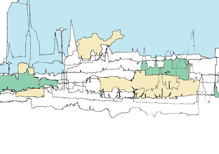
After creating a linea image i then started to experiment with adding colour to the shapes that had been made by the overlapping lines. When i edited my scanned images i lived traced them in Illustrator and then took them into Photoshop for the final editing. The colour was done by using the colour fill tool in Photoshop. It's quite interesting adding colour to the shapes that were made because it makes it harder to see that they are skylines, i started by adding a small amount of colour spread out and then added more colours into more shapes. I stuck with pastel colours as i thought they were a lot softer which allowed the linea drawings to be more dominant.


With the above design, i think the blue works really well, it represents the sky, which allows the top skyline to stand out. Because the lines were quite weak, the blue bled into the shapes, which makes it look abit weird.


I think these pastel colours kind of work well together, and i really like the style i am working in, its very illustrative. Below i added black to see how it would affect the softer colours.


I tried adding text, it reminds me of postcard designs, i think the typeface on the above design works better than the one below, it looks more sophisticated, where as the other one makes my design look cheap and tacky! Which is not good.


I experimented with other colours, but i think i prefer the colour palette of the first designs. As a 'designer' (in the making), and my personal preference, i tend to like simple designs, like less is more in my eyes. Thats just how i roll, so i think i might take my designs back to basics and see what happens from there.


Just had another go with different skylines overlapping. This one looks more interesting than the first one.


I actually think this would look pretty cool screen printed onto a t-shirt (but with my crap time management skills, i now dont have time before hand- in!)


The colour fill felt like colouring 75% of this design blue, but because its only one colour i think it looks alright.

This reminds me of chavs!


And this one is a tad rubbish (but we have to put up our mistakes to learm from them). To be honest i used black on the colour fill and it did this, and i didnt know how to get rid of it! So i started again with the colour.


This was using gradients on the coloured skylines, I dont think the colours work on this one, it has taken away the black outline so it makes it hard to see what the drawing is.


I was lucky enough to to Amsterdam and take pictures for this brief (you cant escape Graphic Design, even on holiday!) I got some of the really pretty houses along the canals in the city centre. So the next few designs are developments from a tracing from one of my photos.


The above image is just the lived traced drawing. Nice and simple.


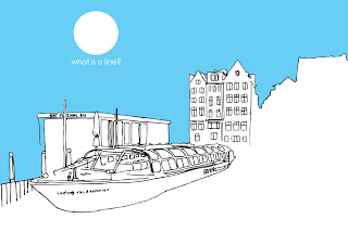
I then added a blue colour fill, which filled nearly everything apart from a few windows, i then added a gradient over he whole image, which made it look like the sun was setting and it was dusk. The windows that werent coloured blue look like they have lights on, adding to the 'night time' effect.


I then added a circle and put it in the sky area, and it looks like a moon. I changed the blend mode so it had a slight gradient on it too. Under the moon i have added the word 'Amsterdam'.


I found a style that i liked, using the more detailed drawings, i made the sky blue and kept the rest linea black and white. It keeps the focus on the skylines but the block colour seems to bring it together and highlight the skyline.


With the design above i added orange at the bottom as it is the opposite to blu eon the colour wheel, the detailed areas are almost stuck int he middle, separating the two colours, it works quite well, but i think theres too much going on with having two colours like this.


Using the blue sky also makes the bottom part, bottomless, there is alot of negative space which gives a lot of focus to the linea drawings. I have added text 'what is type?' in the sky area, keeping it subtle.


I looked at various different skylines throughout this brief, the ones that are from Amsterdam are very picturesque and busy, whereas Leeds looks more domestic and practical in terms of the buildings. They are very square and boring, so there is a good contrast between the two.


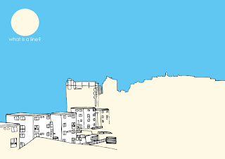
The above designs are of Leeds, taken from outside my flat window on the 5th floor, the buildings that are detailed are part of a council estate, and the linear skyline is the distant city centre. I used a cream with the blue and whit on this design, but again i think more than just the blue makes it too busy. I tried one with just the orange at the bottom part of the image, but without the blue to contrast like a previous design, i think it looks too bright.


The Amsterdam designs are probably my favourite, i like the detailed buildings, they are very pretty. I have added 'Amsterdam' under the sun very subtly, i decided to use century gothic as my typeface, because it is a very simple and modern styled san serif, which works well with my designs, it also has a very thin stroke, so fits in with the linear drawing.


The blue that i used is above, it has been used for the sky and some text in my development ideas.

The Pantone for the blue is: 6CC0EB

C: 53
M: 8
Y: 0
K: 0


I then started to play around with my illustrations and the photographs i had taken for them. I tried overlaying the two images together and then changing the blending mode. The one above was set to multiply, it doesnt really work too well, the blue sky has turned into a turquoise and the detail had been lost in the illustration. The photo is too dominant, which i dont want it to be.


The blending mode on the above design is screen, but where the sun is coming through the clouds on the photo behind, it is taking the black out of some of the linear drawing, which looks odd when down the bottom of the image the black lines are still fully visible.


This design works really well, its actually quite hard to see that the background image is a photo at all, it just looks like a block coloured skyline that has been simplified. The only thing that gives it away is the clouds and smoke in the sky, this adds more detail but with the blue overlay from the illustrated sky, it doesnt become over dominant. I have then added a white circle on the part of the sky where the sun comes through the clouds, which makes the circle look like the real sun. Then i have written the title of the brief horizontal to the right of the sun.


I tried it again with another design, the photo has actually been partly used in the illustration so it works fairly well. The blending mode used on the other design didnt work as well on this one, so the blend mode i used was screen, but it takes away some black lines. But the concept is good,the outcome just didnt follow through as well.


Unfortunately i didnt go to China to capture this really traditional building, it was a canal restaurant in Amsterdam that could hold something crazy like 800 people for dinner! All the images used were primary sourced, all the work is my own, not Google images!


I thought it would be a cool idea to place all of my illustrations next to each other in a subtle way, so that they flowed into one big long skyline, showing the contrast between the different places i visited. The image below shows how i have laid them out. I had to do it on an A1 art board because i cant afford to print them out in one long line. There are four designs next to each other on each row, the white gap at the end of each is where i will stick them together to make one long line. I am also going to print out this as a poster.


The above image is the last section of my long skyline, i chose this particular illustration because it has an end line. where the skyline disappears. This is the Leeds market, with the photo being taken from the car park. I have kept the title of my work straight to the point, the names of the places i got the skylines from and then the word skyline to mention the focal point of my work, presented with my name.

Below are photographs of a mock up of my long skyline idea, i printed this small in the mac room to show how my final outcome will work. It could be a wallpaper border in a room if it was mass produced.


---------------------------

After doing my design for the long roll of skyline, i thought i could do more, so i set about creating a hot dog book. It has a similar content to the roll but it includes my quotation about line which is "a formation of people, objects or things on besides/ behind the other."


The design above was the one that i originally came up with, it presents my theme, the title of the brief, the quotation and my name.


When i got to print and looked again at my design, i thought that the front and back page looked really out of place when the book was laid open, so just before printing i changed my design. I really liked the negative space that was being created by the top and bottom skylines, so i chose two more of my designs and added them in. The text was moved around and made smaller, so if someone wanted they could open up the book and make it a poster without the text being too dominant, but its still there.

Below is the book laid open without the text, i think it works really well as a poster and you can have it up which ever way you like best.