The Brief
You are required to create an edition of ten hot dog fold "books" visually/ contextually based upon the colour/letterform/ shape you were given for the photography brief.
Considerations
THINK VISUALLY. Consider what the visual essence of your subject matter is. What are you trying to communicate and how do you do this most effectively?
Appropriate format, scale and content for the 14th International Contemporary Artists' Book Fair.
You must explore colour, type, sound and shape before selecting a subject matter...
Practical considerations
What is a "book"? How can you challenge this in terms of media, process and context.
As you will be producing an edition of ten books will this effect how you will have to make decisions regarding reproduction within the time scale and the cost?
Background
14th International Contemporary Artists' Book Fair, Friday 11th and Saturday 12th March 2011. The Parkinson Court, University of Leeds.
The Contemporary Artists' Book Fair presents unique and multiple book works by artist and publisher from around the World.
Mandatory requirements
All images should be supported by a broad range of visual investigation in the form of design sheets and notebooks.
An edition of TEN books.
Deliverables
An edition of 10 books
------------------------------
My initial idea was to create a series of illustrative drawings based upon 3 worded phrases that have become well known. For example the ones i chose to illustrate were:
- Spill the beans
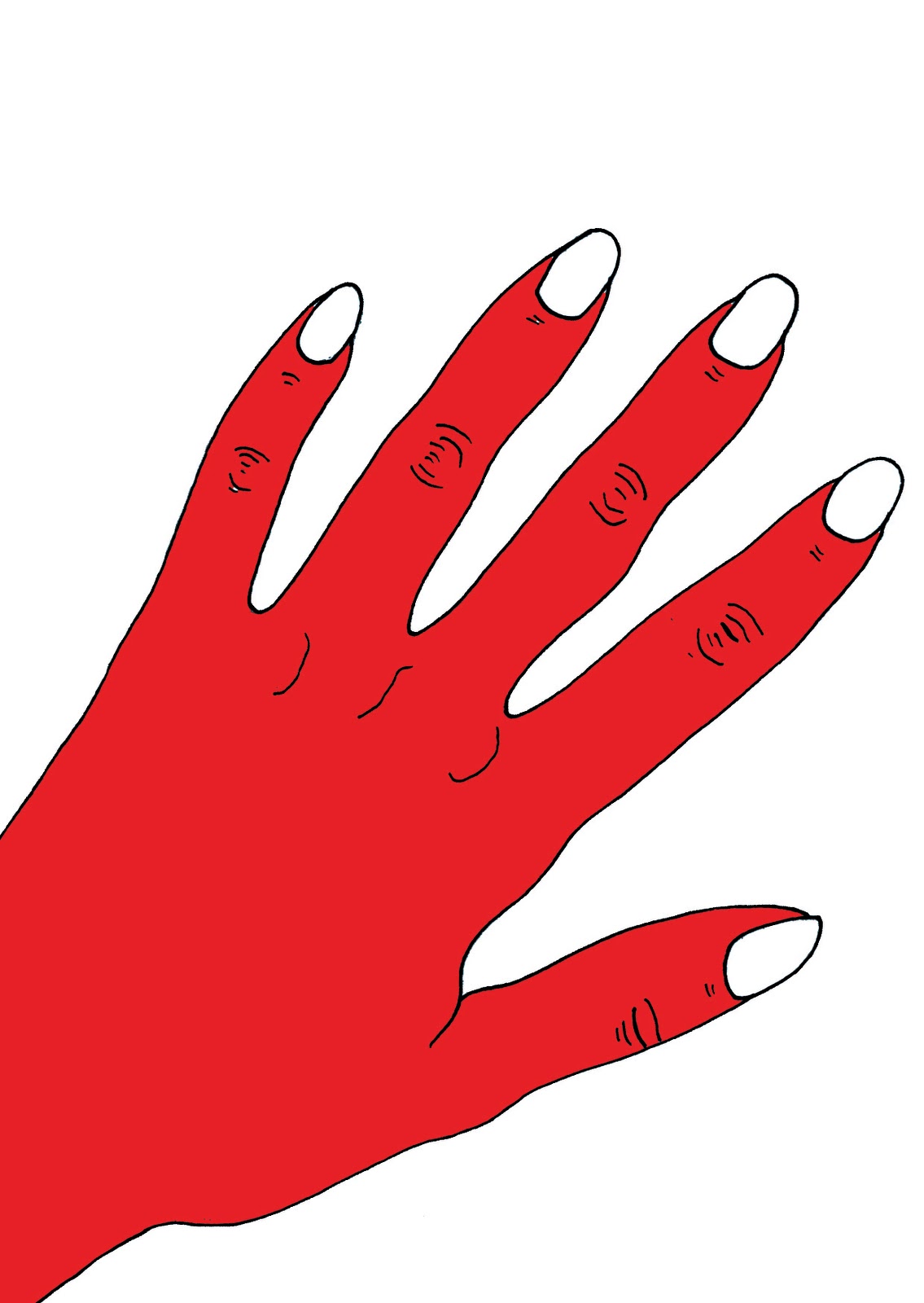
- Caught red handed
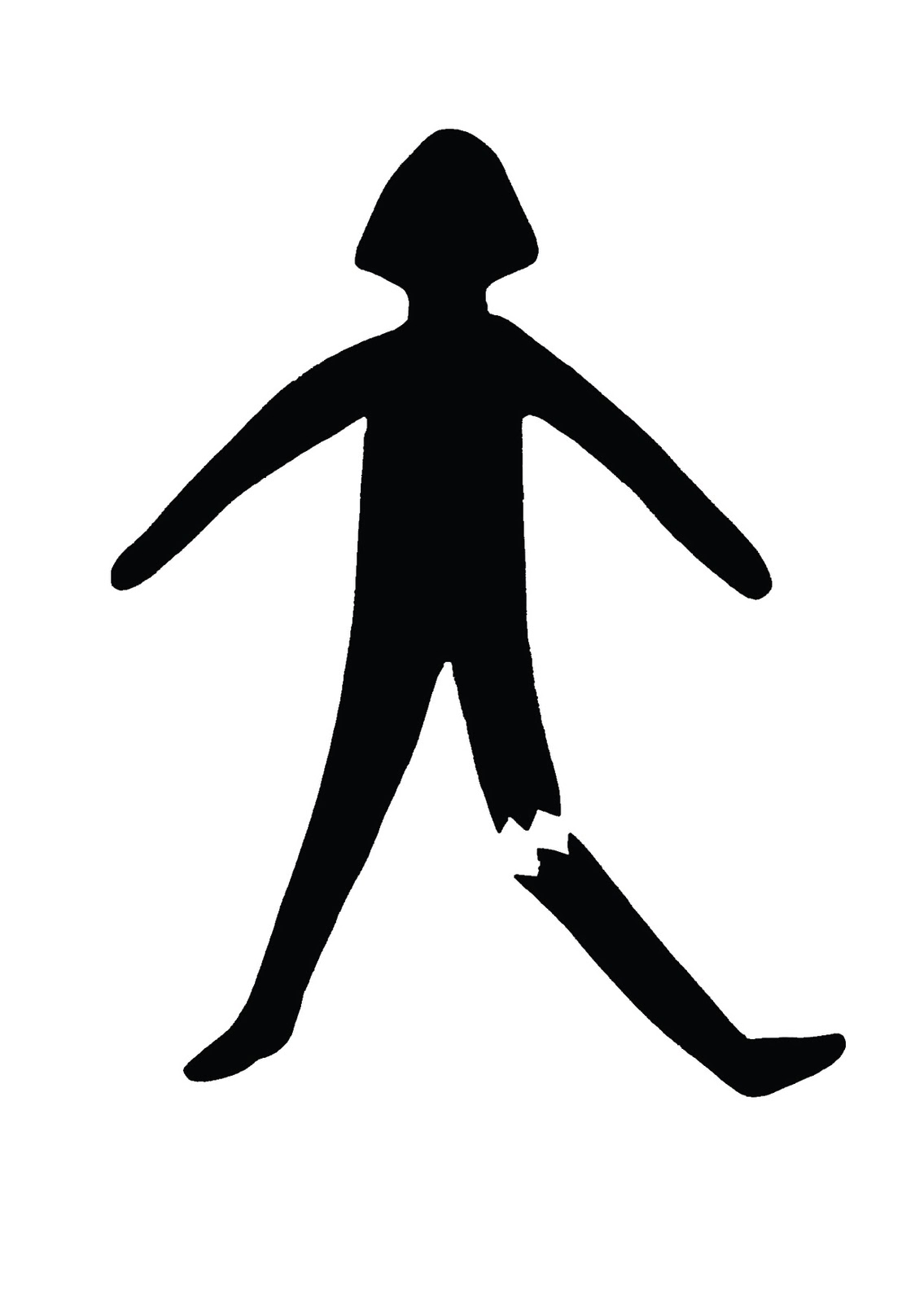
- Break a leg
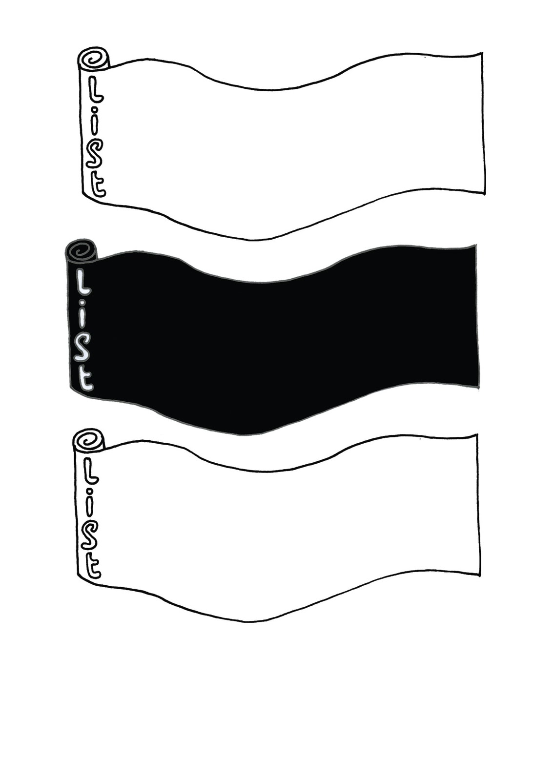
- The black list
I decided to take a hand drawn approach because it is not a style i usually use and i thought it would be good to experiment. After compiling my book onto the hot dog layout on illustrator and printing to fold it, i decided that i didnt think the style i had worked in showed my potential and i thought it was a mistake to try and do something i maybe was too good at. So i decided to change my idea as i felt that it wasnt my best effort.
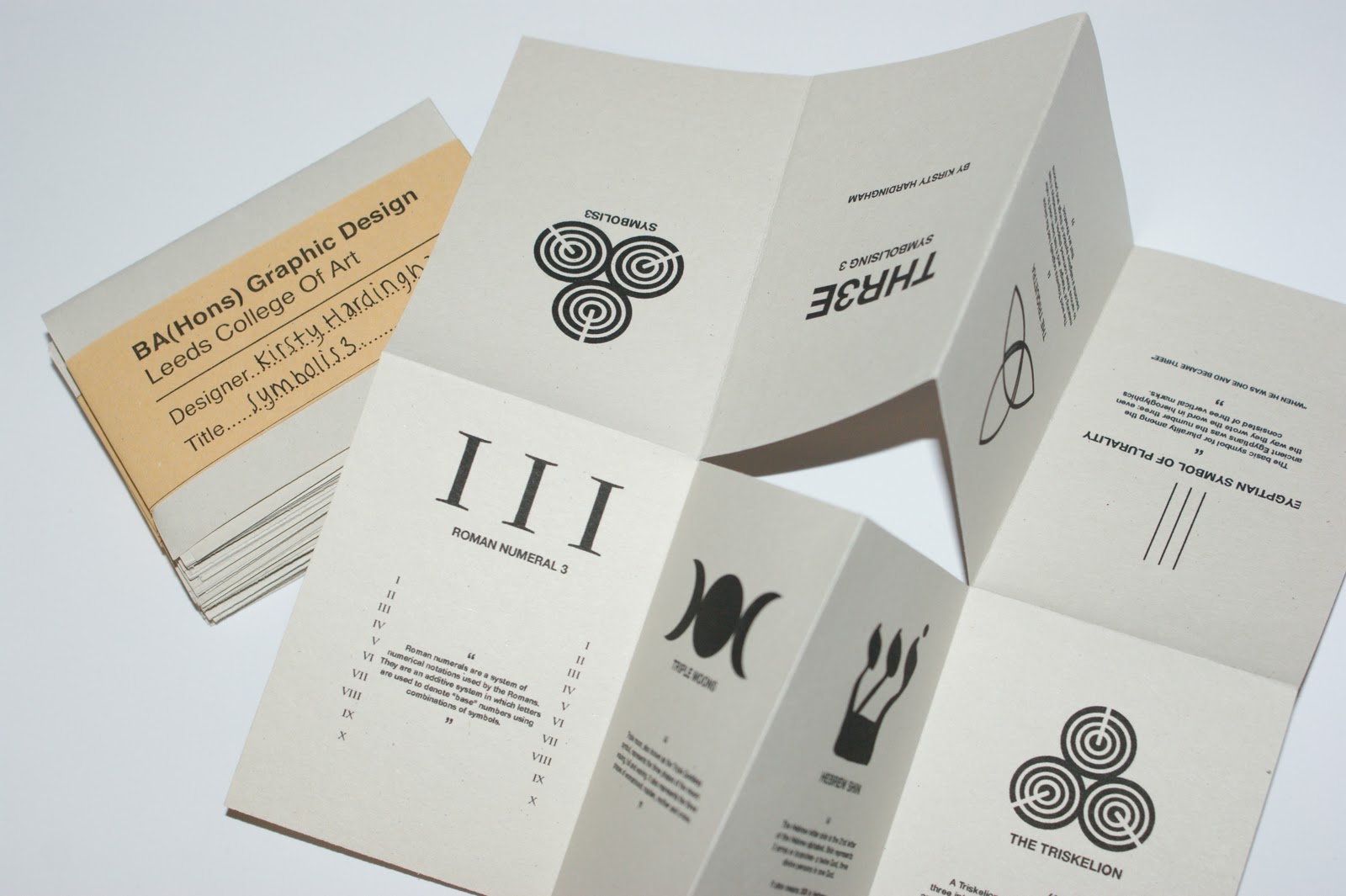
The design that i changed to involved looking at symbols with a resembelence of 3, such as the triquetra and the hebrew shin. I find symbols more interesting personally and the simplicity of the design was also a way in which i prefer to work. Each symbol has a small quotation explaining what it means. Im glad that i made the decision to change my design due to the reason that i didnt feel i had made my best effort, now i have finally finished the books i feel that i have learnt a lot about making mistakes and learning from them in graphic design.


-----------------------------
This is the final layout on illustrator for my hot dog fold books, i decided to print it onto an off white sugar paper because it gave some texture and age to the design. The paper itself had particles within it which gave my book a more natural, organic feel which worked well with the content of looking at old symbols. I have printed my books as an A4 format as i thought A3 was too big and it would also cost more to print. I didnt double side my books because i didnt have the time to produce something worth while for the other side and i didnt want to put something on it just for the sake of it.


Here are my final books with their belly binds.


No comments:
Post a Comment