Monday 21st March: Group discussion
We started to look at colour and scale of our posters/ ideas today, we decided to stick to a fairly neutral colour palette, as we didnt want our posters to be too 'in your face', we want them to be almost poetic and our colours needed to reflect on this. Because our posters are typographic based and some of us are hand drawing them we figured that they would all have a different style to them, so we thought it would be a good idea to design a logo which help give visual consistency throughout the poster designs, we would also have them the same size and orientation, and using the same colours.
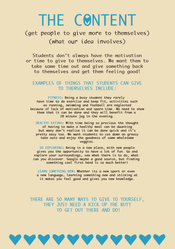
As a group we thought that it would be a good idea to come up with 5 final posters each, which would give us 25 different designs in total, because we each had a category to work with (mine being fitness). Because we are designing the posters to motivate individuals in our class we wanted a variety of designs and styles that would appeal to a large percentage of people, we want them to have an individual feel to them.
Size of posters: A3 with a ratio of 2:1 = 198 (w) x 420 (h)
We chose 2 colours plus stock which are:
Pantone 3135c Solid coated
Pantone black 4c Solid Coated
Pantone 7506c Solid Coated
C: 6
M: 11
Y: 28
K: 0
We settled on these colours after looking at the meaning of colour and what effect each colour has psychologically on a person. Blue can be a calming colour but electric/ brilliant blues become dynamic and dramatic and can be an engaging colour that expresses exhilaration. Brown is known for stability, reliability and orderliness. The stock colour of cream was chosen because we felt it worked well with the other two colours, its a very neutral colour.
We want the blue to provoke exhilaration and motivation in someone to get them to get up and give more to themselves and we want the brown to give them confidence and orderliness, if they can find the time to help themselves then they will.
-------------------------
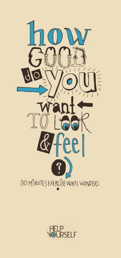
I decided to use one of my initial poster designs to test the colours and they appear to work well together, the blue really stands out against the stock colour and the rich brown. I would like to keep this design as part of my final five, but following the last crit i may need to edit the content to make it more motivational and specific.
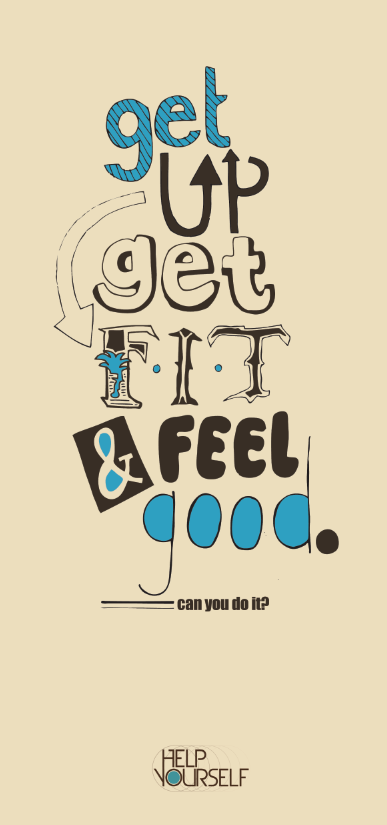
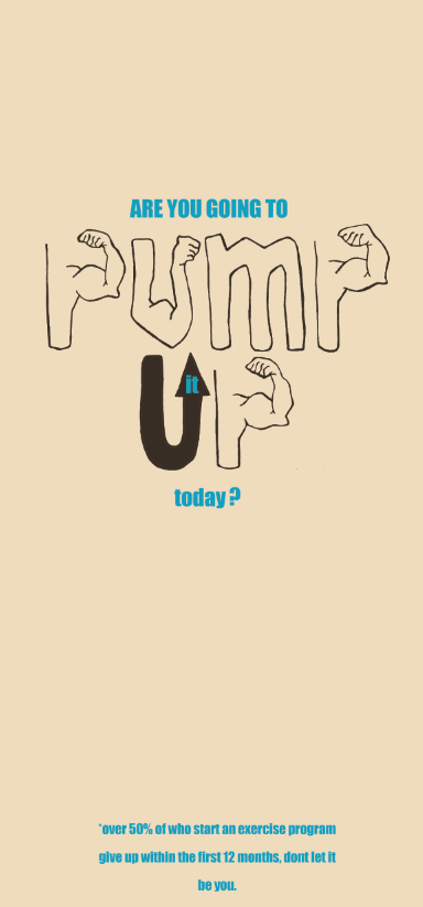
This design again is a previous one that i am testing the colours on, i think it works better on the design above, i really like the type that i designed on this poster but it lacks something. I have made it into a question to try and provoke someones thinking in whether or not they are going to get fit. By asking a question the individual had the chance to answer it themselves, i guess in a way its trying to make them feel guilty about the decision that they are making.
--------------------------------
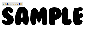
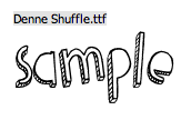
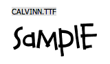
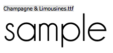
Typeface research for posters
-----------------------------
DESIGN BOARDS EDITED
These are the new idea boards edited using our new, revised idea and the restricted colour palette.
----------------------
Poster designs by Steph with the restricted colour palette
Steph's logo design:
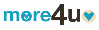
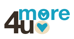
Matt's logo designs
Matt has designed some logo's for our posters to give them a visual consistency, the designs have been kept quite simple and to the point, i think that these designs work well but maybe the wording could be changed. Help yourself seems fairly appropriate because we are wanting people to help themselves and give more to themselves. I dont think 'NEW YOU' is appropriate to the content and purpose of our posters, the design itself looks good, but' new you' doesnt really promote what our aims are.
I have tried the logo's on my posters and they do work well, i think my favourite from these 3 is the top one, it's saying 'we have given you the motivation now you just have to help yourself'.
--------------------
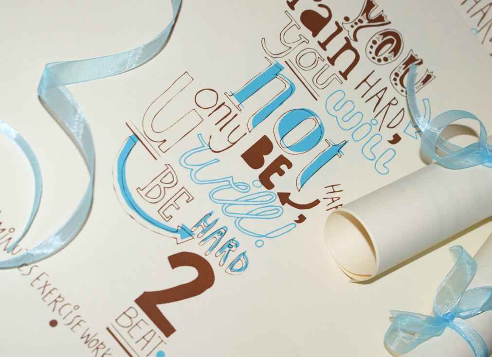
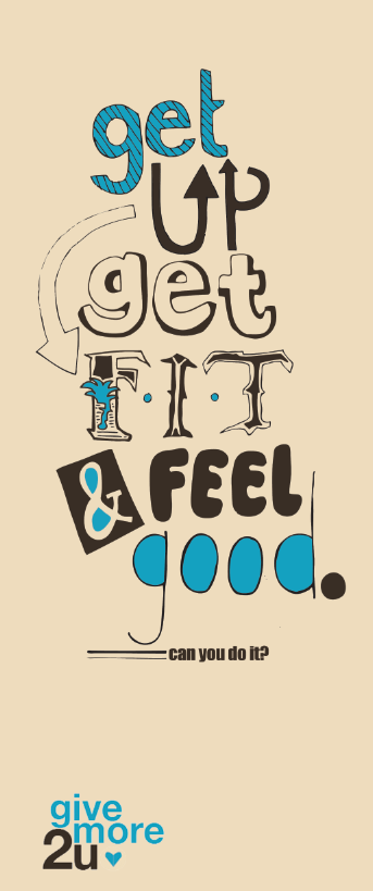
This is a new poster design that i hand drew using typefaces from dafont for inspiration, the layout may seem messy but that is the style we are aiming for, very hand drawn and individual. I tried to use decorative and simple typeface to give it a random look.
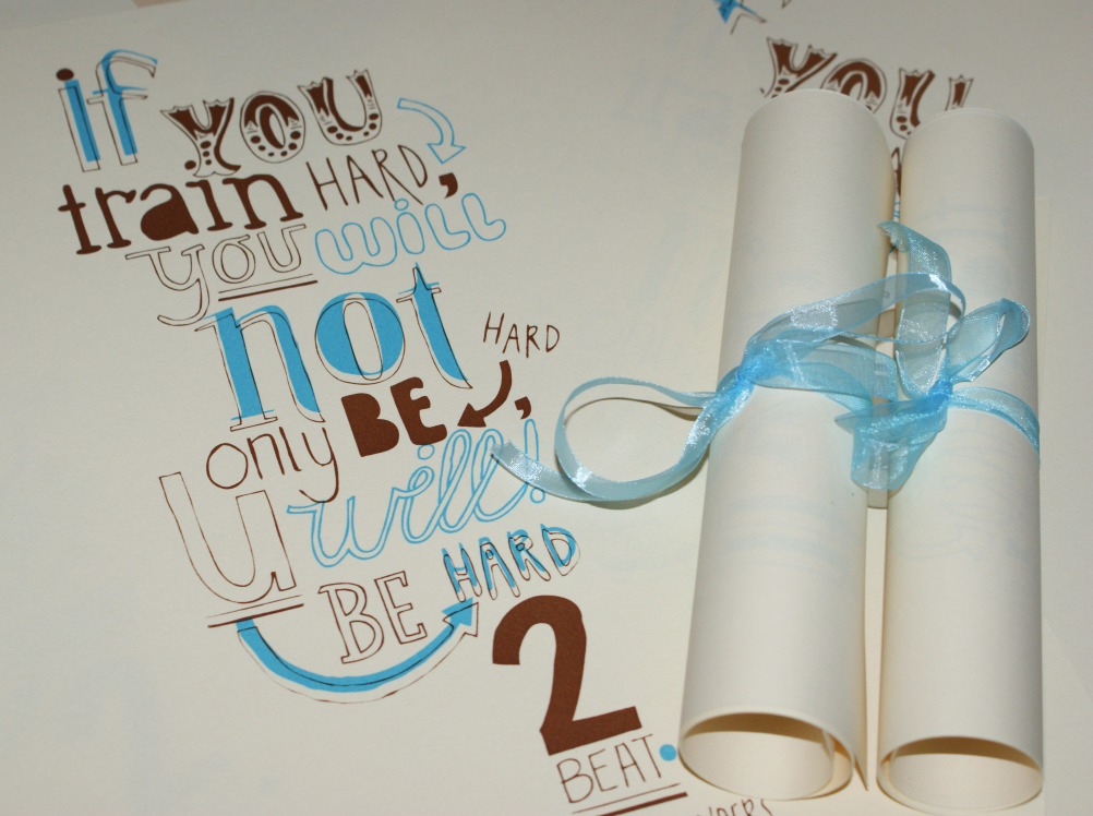
With this poster i have added Matt's logo to see how it works with my design, i dont think it matters that Matt's logo is digitised compared to my hand drawn poster, because if all the posters have the same logo it gives them all continuity anyway.
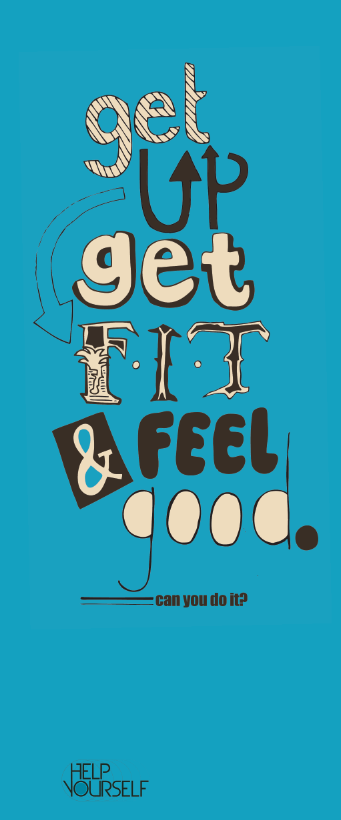
I really like this poster with the change of stock colour, it really stands out and feels more vibrant, if i had this in my room i think i would definitely look twice at it and it would make me think about doing some exercise.
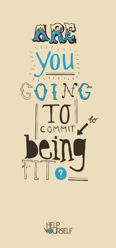
With this poster i added a question with digital type at the bottom of my hand drawn design. The hand drawn part is simply a statement and from our last crit we were told that we need to pose a question to make our audience think which may provoke them to take actions. ' Can you do it?' is making them think about the actions they may or may not take, are they strong enough to take action towards the statement?
------------------------
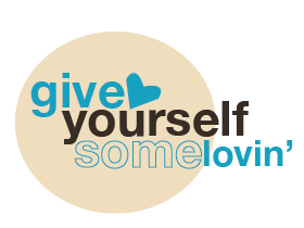
These are my attempt at creating a logo for our posters, i have kept to our colour choice of blue, brown and cream (stock). I have used helvetica neue typeface as its quite a modern and simple typeface, i have also used the love heart that is on the 3 idea boards, it has a jagged hand drawn feel to it which i think helps link in with the designs of the posters.
These are my poster designs with my logo on to see how they work, i quite like the one that says 'give yourself some lovin', the one that says 'more 4 u' now reminds me of 'phones 4 u' so maybe its not a good idea to use it as it may not seem new and original.
------------------------
SCREEN PRINTING
I decided that i wanted to screen print one of my poster designs so that i used a different media than what i usually would like using digital print, i think screen print gives a really nice hand made feel which is suitable for the hand drawn type designs.
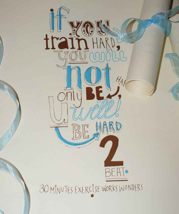
This is the design that i am going to screen print, it was the last design that i did and i think it is the most successful, i like the type faces i have used and the way in which i have laid them out, it looks very hand rendered. i think the style of it will also appeal to the younger audience of whom we are aiming our work at (students). We decided to use one of Matt's logos as we felt the design worked well and so did the content of the logo.