A new typography book being published by HOW books is now accepting submissions, selected work will be featured in the Letter, Word, Sentence, Paragraph due for release in early 2012.
Letter, Word, Sentence, Paragraph will break down the study of type into systematic progression of typographic relationships using content examples, interviews, and real life inspiration.
You are required to submit a series of three TYPOGRAPHIC posters that focus on the word 'OPPOSITES'.
Deliverables:
A visual investigation into 'opposites'.
A minimum of thirty thumbnail possible typographic poster design treatments and supporting design development work.
The three posters you intend to submit.
----------------------
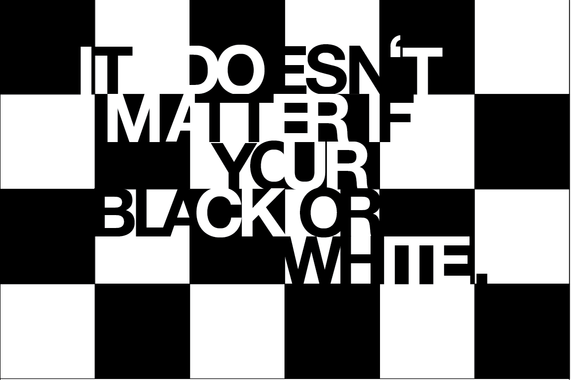
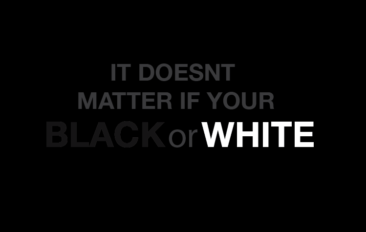
This is one of the first ideas i came up with when i received the brief, it was based upon the opposite of black and white, i incorporated the phrase 'it doesnt matter if your black or white' into this design as the type element. I used black and white squares as a basis and then started to apply the type, because of the way in which it is set on the squares, you have to look closer to see what it says, which i think makes the design more visually engaging. It's a very simple yet affective design that does play with type and the use of opposites.
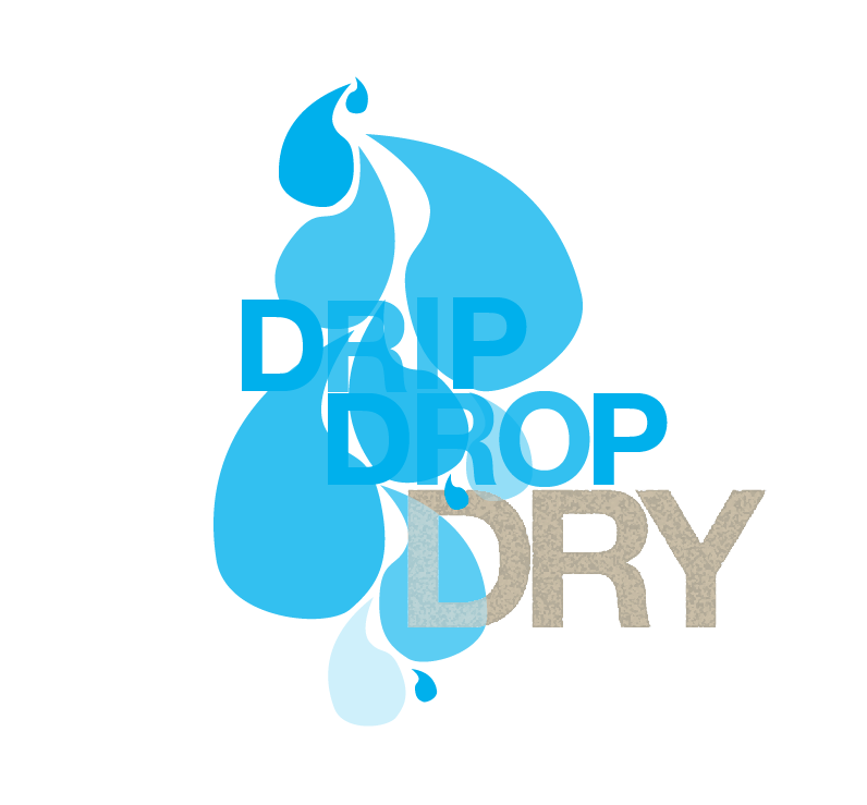
I really like the idea behind this design, the opposite is wet and dry, it drips down until it hits dry and i think the way in which i have portrayed this works well because i have done it in a literal way. I added a photoshop artistic effect on the word dry to give it a dry texture which has worked really well.

I played around with the word opposite with this design, i have simply arranged the word opposite onto another opposite in an opposite kind of way. When you first look at it you mistake the p's for capital B's because of the way it has been laid out, which i think makes it more engaging.

I then have experimented with colour, using the opposites on the colour wheel with complimentary colours. I then coloured the name of the colour in its complimentary colour. The two that have worked the best are blue and orange and green and red.

I have used circles of colour that have been overlapped to create other colours with this design and the used type with a low opacity to incorporate type.
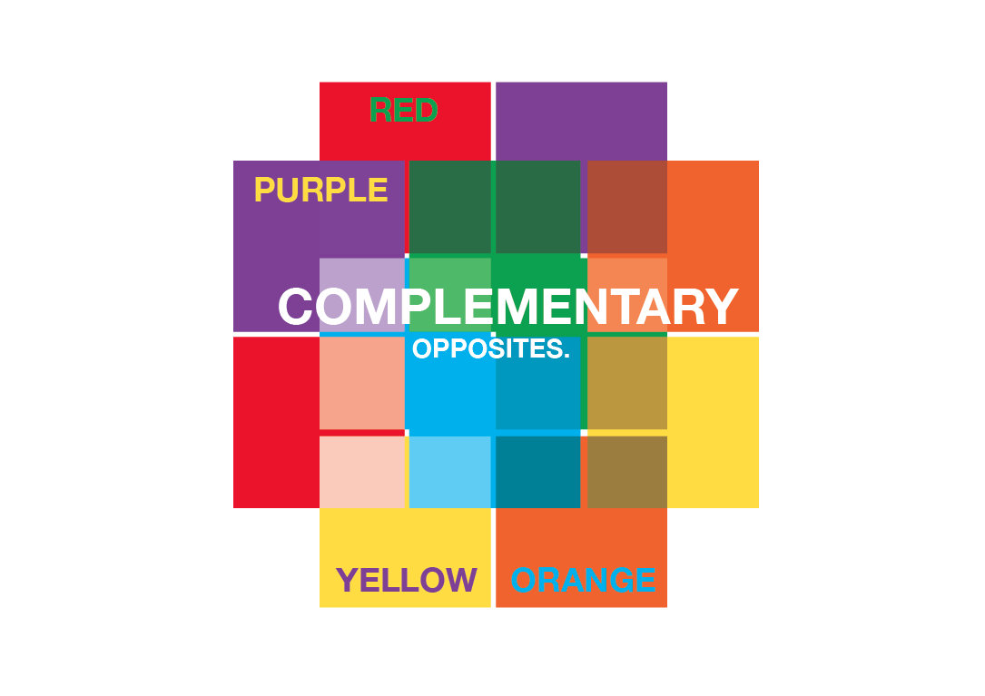
I dont feel that this design focuses enough on the brief of typography, its more abut the opposites of complimentary colours.
----------
Focus theme: BLACK AND WHITE
Concept: DIGITAL/HAND CRAFTED
I have now narrowed down my opposite idea to black and white, i chose to do black and white because it is simple and i have a thing for black and white.
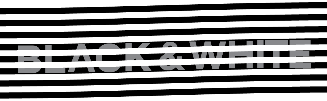
I used slightly wavy lines on this design to try and create an optical illusion of which i then added type within the lines with a low opacity. It does trick your eyes into thinking whether or not the lines are straight.

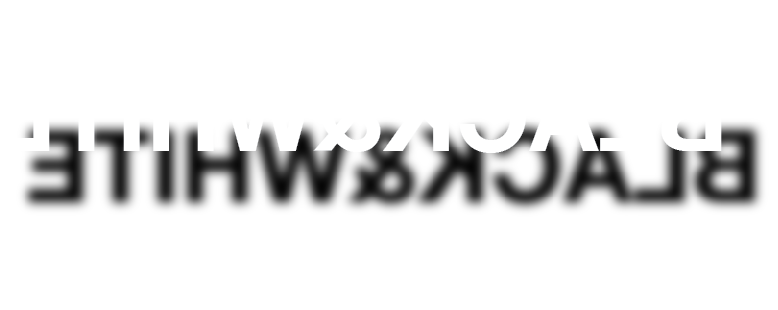
This was simply a case of turning black white and white black and then overlaying the two, i dont think this idea is visually exciting or original, but we all make mistakes.

I think the idea behind this was a really good idea, i used the frame of dominoes and have used the white dots on the dominoes to create letters, it is a little hard to make out but i think once you have realised what it says, it works well.

A lot of my designs are quite simple, this one was just using lines to split the words and letters up, i dont think its an amazing idea but it looks all right.
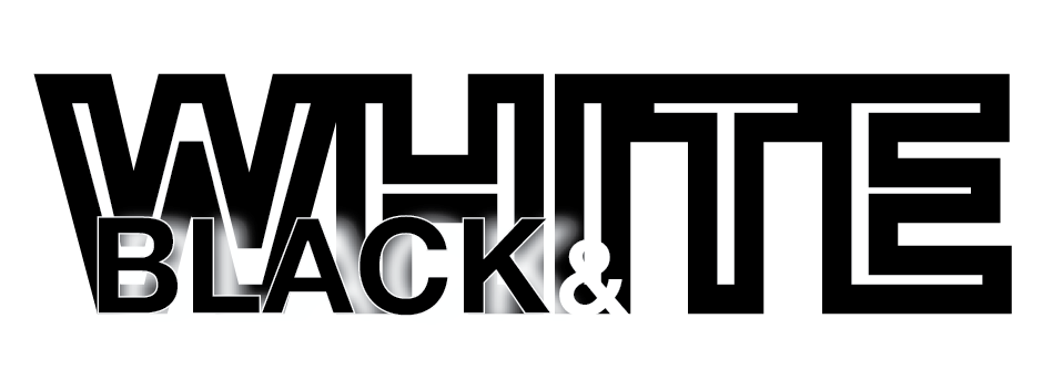
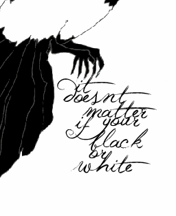
I think the use of the shadow was a good idea and how it works backwards too, you can see the body of type but you only know what it says because of the shadow.

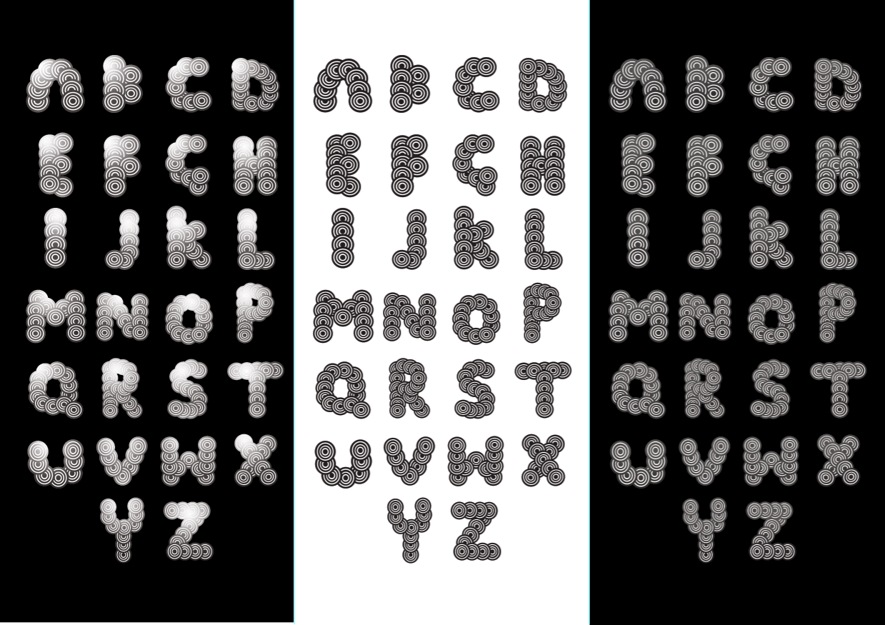
I designed a typeface based around black and white circles, which i really love, its almost like an optical illusion typeface. Its made up of loads of layered circles which fit into one another to create the letters. The letters are in upper case because they were simpler shapes, i tried not to use too many circles on one letter because it becomes too complex and looks a bit messy.


I really love magpies and think they are beautiful birds, they always look so crisp and clean with their black and white feathers. And seeing as they are black and white i thought how i could use them in my designs. I found an image online which i drew from to create my own magpie, which i then coloured on photoshop.
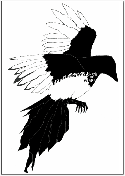
The typeface i used is elegant much like the magpie, but i dont feel that it flows well enough in terms of where i have placed it, also this design doesnt really focus enough on type.
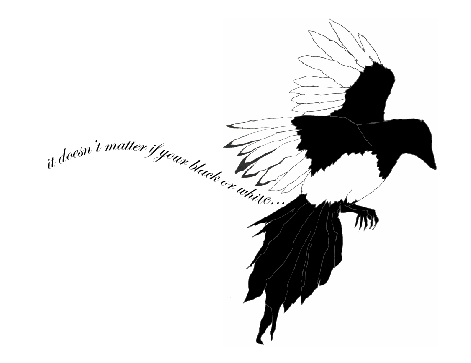
This design is a progression of the above, i have moved the text and placed it on a flowing line that fits into a space between the magpie.

With this design i have placed the type within the magpie, changing from black and white type, im not sure if the typeface works well or fits in with the magpies elegance, but i like the subtlety.
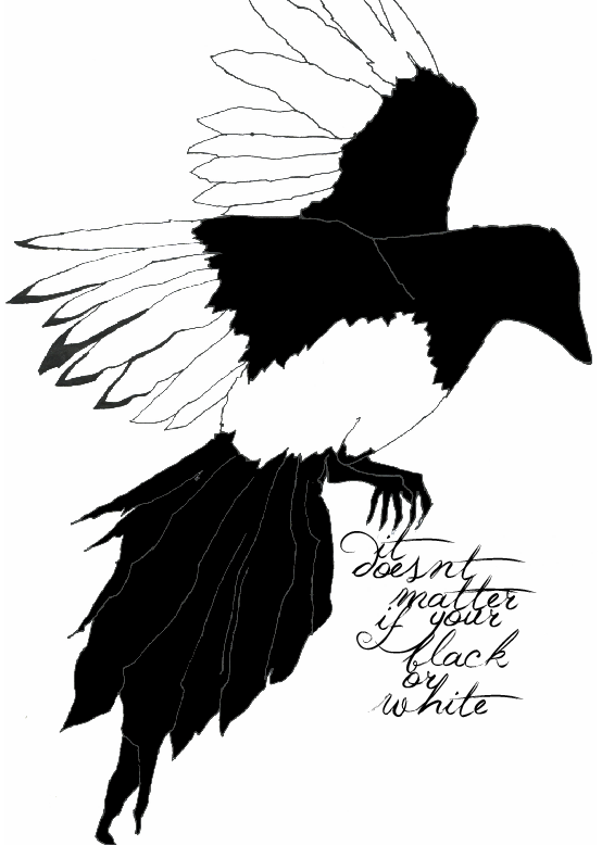
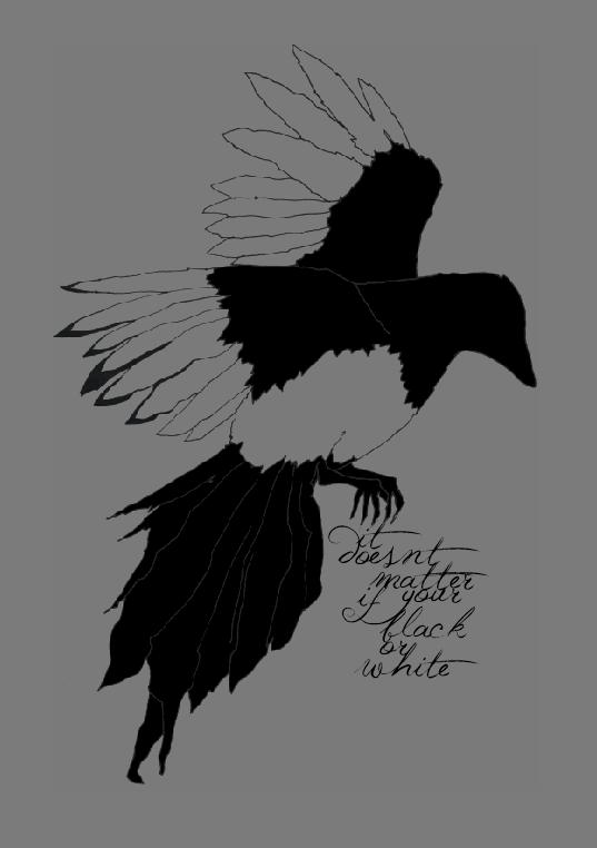
As i experimented more with type i found that my designs became better and more visually interesting as well as fitting the brief better. I tried to make the type look like it was flowing from the magpies feet, i then made sure that each word hung onto the next so it looked like a continuous flow of text. The typeface that i decided to use also worked better because it had an elegant and hand drawn feel to it.

I tried to do the opposite with this design by going back to keeping it simple, i used a circle to try and make it more contemporary looking, i then put in quotation marks the phrase 'its not all black and white'. The magpie is then sprouting from the shape.
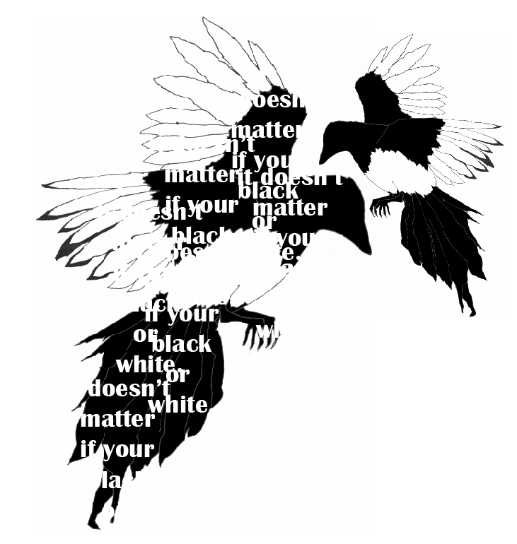
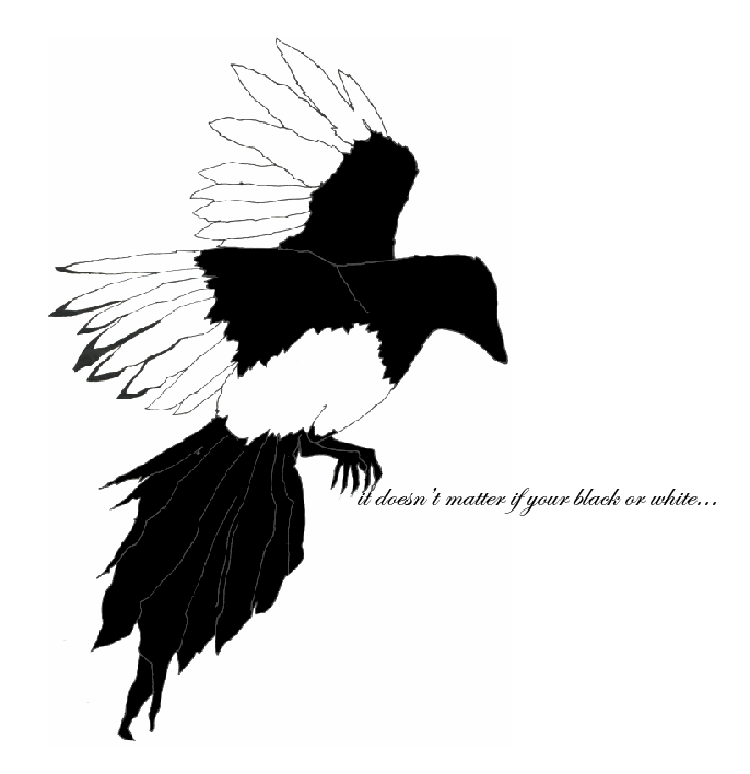
With this idea i put text through the black parts of the magpie, the type says 'it doesnt matter if your black or white'. The idea works well, i just dont know if the typeface is suitable.
-------------------------

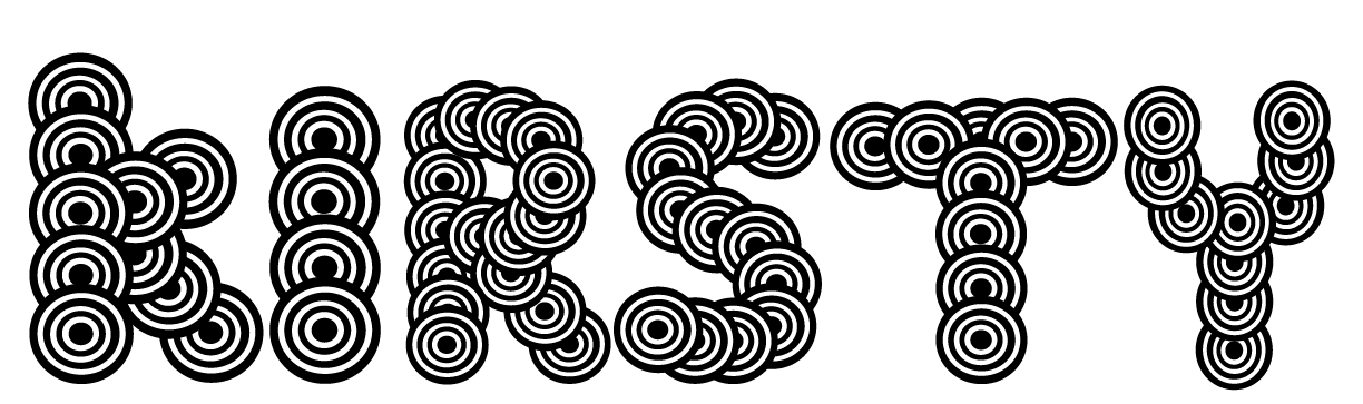
This is the completed typeface i designed using circles and an example of it in practise.
These are the 3 posters that i submitted in the competition.
----------------------------
I decided to change the layout of the posters, by having one white, one black and one half and half, i also added my logo to the bottom of each one. My favourite one and the one that fits the brief the best is the half and half poster, it just really stands out and looks like a refined piece of finished work.


-----------------------
Seeing as the brief was opposites and i had focused on black and white, i thought it would be useful to see what the design looked like with different colours. I stuck to using complimentary colours and then moved on to colours that worked nice together.


The above designs were the pre set solid colours in illustrator, hence why they are so bold. I think that the blue and orange work best, the red and the yellow are a bit too bright and over powering. You end up focusing on the colours rather than the type.


The ones above are using a mixture of colours that are not necessarily opposites, but its interesting to see what they look like.

In a way this one is still focusing on opposites because pink is similar to red and then i have used green too. These colours are pastels and really soften the image, i have changed the blend mode of the type to lighten, which has literally lightened the type to white.

This design above, works really well, the royal blue and purple really bring out the white type and makes it look slightly silvery. The only thing that doesnt look right is my logo because it is lost in the deep blue.

The browns i have used look pretty good, very earthy, again not really opposites though.

These two pastel colours are really nice tones but because they are so light the type is lost slightly in them, if they were slightly darker it could work really nicely. I dont think changing the type back to black would work because it would stick out too much.

These peachy colours are good enough to eat, they are just the right tone to bring out the white, i particularly like the warmth of the right hand side colour.

With this one, i used the warm peach from the one above and then a cold blue (which i guess means their opposites), i then changed the colour blocks to horizontal rather than vertical , but i dont think it has the same visual effect.


