For the illustrator brief i chose to visually experiment with the letter 'B', i chose to do a capital B to set myself a challenge as i do feel its maybe harder to experiment with in a wide variety of ways. It also linked in with my flattened B from a previous brief. I needed to produce 26 variations of my chosen letter. Below are variations of my letter, produced in Illustrator. I have experimented with the bowls of the letter, the stroke weight, height and elongation, disfigurement of the outline, pattern and anything else that i could find to transform my letter.
I particularly liked the aesthetic qualities of playing around with the distort and transform tool, there were so many variations you could create, some subtle and others completely changed the formality of the letter.
We were allowed to use one colour (not including black or white) in this brief, i decided to use red as it stands out but i only coloured my original outline to emphasise that this is what i started with and i ended up with a wide variation of B.
Below is my final 26, they were to be presented on A2 landscape consisting of two rows of 13. Together they all work well and do show a variety of visual variations. I have chosen to use the samples that i distorted with the distort and transform tool. I like the curvaceous shapes and the similar continuity between each letter form. Keeping one letter form red looks really good too, it just adds that tiny bit of colour that i think brings it all together.
I do particularly like working with black and white as it keeps it simple and crisp, i mainly wanted to look at shape and keep it simple, i did experiment with different brushes and patterns but they were too fussy and it took you away from the smooth shape of the B.
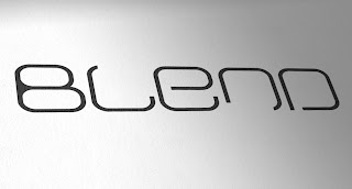
Examples of others typographic experimentations:


No comments:
Post a Comment