We looked firstly at the 3 primary colours and what colours we can create with them.
The primary colours are red, blue and green.
You would then combine the primary colours to create secondary colours:
Red + Blue = violet
Red + yellow = Orange
Blue + yellow = Green
Then combining one secondary colour with a primary colour to begin to create an array of tertiary colours:
Yellow + Green = Yellow Green
Blue + Violet = Blue Violet
etc...
You then have complimentray colours which are two colours opposite one another on the colour wheel, for example Red is the complimentary colour to Green.
When it comes to design there are only two different colour modes, RGB and CMYK.
RGB = Red, Green and Blue
RGB colour mode is used for screen based viewing only, it is known as an additive colour and is what makes light. If you mix RGB you would make white.
CMYK = Cian, Magenta, Yellow and key (black)
CMYK is the colour mode used for any print/pigment based media, it is known as a subtractive colour, which means when you mix it it takes colour away and you will eventually end up with black.
Much like when its sunny, RGB would reflect light like the colour white, whereas CMYK which turns black, soaks up the colour.
From these basic principles we started to look further into the colour wheel. There are over 16 million colours in what we see. From the three primary colours you also have things like the shade, luminance, illuminance, hue, saturation, desaturation, its chromatic value and tints.
Shade:
The shade of a colour is made when you make it darker by adding black.
Tint:
The tint of a colour is when you add white to make it lighter.
Tone:
The tone of a colour is when you add gray, each gradiation gives you a tone.
Hue:
A hue is a type of a colour, there are so many types of red for example, but they are all hues of the primary red.
Saturation:
Saturation is when you begin to think of a colour as weak, pale, pure and strong. It is how a colour looks dependent on the amount of light it is under.
Chromatic Value:
When you start to describe a colour as 'light' or 'dark', thats when you are talking about its chromatic value or 'brightness'.
Neutrals:
If you start to mix complimentary colours you will eventually take the colour out and end up with a neutral (gray).
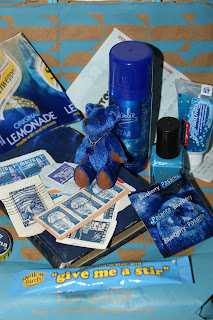
For the colour theory seminar we were given a colour (either primary or secondary) which we then had to collect objects of that colour. I was given the colour blue, above is the collection of my blue items. I gathered:
- A blue charlie spray
- A small blue teddy
- A blue t-shirt
- A blue reciept
- A blue topshop bag
- A blueberry condom
- Some blue bottle tops
- My Argos name badge
- Blue nail varnish
- Blue toothpaste
- A blue lemonade wrapper
- Some blue stamps
- An old blue book
- A blue coffee sachet
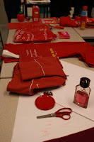
We were then put into colour coded groups. We then sat around in a circle as the same order as the colour wheel and we arranged our objects in accordance to the primary and secondary colours of the colour wheel.
The photos below show the sequence of the colour change as it went around the tables/ colour wheel:
It was a fun and extremly interesting task, you dont realise the importance of colour and colour theory and how you can be asked to collect blue items but find that you have gathered altogether in excess of 30 different blues.
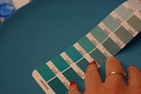
Examples of Pantone swatches, these two are worth about £200!!
Pantone (PMS):
Pantone, also known as the pantone matching system, is a colour swatch system used around the globe to identify colours. The system makes it easier for designers and printers to make clear the colours they want printing, whether it be in a UK printers or a printers in China.
Below are Pantone swatches, i found the colour to some of my objects within the Pantone matching system. It's a usefull skill in learning how to coordinate colour, especially as a proffessional designer who is sending off for a £500,000 print!
Colour makes the world go round.


No comments:
Post a Comment